Pages

Thursday 19 July 2012

Manuel Estrada: to write or draw, that is the question

Where Ideas are Born. Juggler´s Sketchbooks. was such an inspiring exhibition. I left feeling drunk! Purely from excitement and a burning desire to draw and create! In the beautiful lofty space of the fourth floor at MUDE this was the showcase of Spanish graphic designer Manuel Estrada. I often wonder whether I should have done a graphic design course, text, font, layout and picture assembly is something that makes me go all ooooooh wobbly! There's nothing to say this desire can't be a fuel for my work on the Dec Arts course though and if surface is where I'm headed then it's all good for that anyway! So, the exhibition....

Walking into it you are first met by a wall of open sketchbooks which you are encouraged to flick through - how brilliant!


 Then there is an engaging display of sketches next to finalized logos and mood boards:


This exhibition is all about ideas...
Such an amazing space!

involving process
showcasing illustration for the books of Jose Saramango,
typography,
Collage...
which reminds me...
I am yet to put up a post about the Matisse exhibition I went to recently...
I will follow this up soon..

It was nice to see drawings for the collages too

A large part of the exhibition was given to his book covers to which Estrada says:
A book's cover is a window through which we glimpse the books content. A good cover should not only serve to help to sell a book. Once read, the cover has to be remembered as a true, memorable and accurate interpretation of its content
 I liked an awful lot of them, but this was one of my favourites, I love the simplicity:

 
Many of the covers were displayed on sheets hanging from the ceiling. The original drawing was on one side, the final cover on the other - it was a really effective display

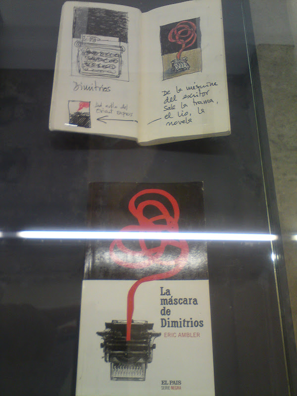
others were in display cases with the sketchbook workings
to the side, this worked well too.
Estrada talks of distilling ideas:
We have to remove the excess on paper. Simplicity as a distillation of the complex. As a reflection of the most primary content of form.
 I love that, 'removing the excess on paper', I find it similar with this blog - allowing me a space to expell all of my discoveries, interests and ideas. One line at a time, in some kind of order, to then assimilate over time and make a new again.

Again I loved the words written around the information boards! There's just something about the way they are written that I cannot do justice if I attempt my own interpretation. Like the marks of a painting or drawing themselves, it's better if I share them, rather than missing out in my poor adaptation!
The source of the creative impulse is a mystery. Ideas can come unexpectedly, anywhere and at any time - Paul Rand
 And to finish, oddly, with the introduction to the whole show! In keeping with my post on Eduardo Salavisa and sketchbooks in general, you might notice an obsessive theme:

We can always see Manuel Estrada accompanied by a small sketchbook where he jots down words and drawings, makes pictures, cuts out and sticks a variety of materials. And because creativity is a fleeting phenomenon, it needs to be grasped in the moment.
Where Ideas are Born. Juggler´s Sketchbooks brings together Manuel Estrada's most personal, unpublished work through his visual diaries and sketchbooks which show us the graphic designer's creative process.
On the journey we find a juggler whose graphic pirouettes weave fascinating images that help to simulate our collective imagination

Exhibtions at MUDE

MUDE is Lisbon's Museum of Modern Design and it is housed in an old bank. Nothing has been rendered inside so it's all exposed brickwork and interesting ceilings. It is an incredible space to be in and with free entry, it is definitely worth a visit!


On the ground floor there is the permanent exhibition Unique and Multiple: Two Centuries of Design. This is a fantastic display aided by music of the time, and with a better head of knowledge after my year of contextual studies I found this a real joy to walk around. Lots of information and debates upon the boards. One that specifically took my eye was that of the design company Droog. I was already aware of them as a company but found the words written about them very fitting for my current head space: 
Droog debate the idea of luxury...cross-contaminating the borders between art and design. Developing new materials; flexible ceramics, electro-luminescent fabrics, metallic foam, elastic fibres, plastics that conduct electricity and emit light, synthetic polymers, alloys that memorise shapes...
There was also some text about Antwerp and it's links between art and fashion. I'm really keen to visit! The MHKA looks good and with Belgian beer and jazz to while away the evenings - what could be better!?
it's dynamic, young creativity and cohabiting of opposing styles and languages, together with Sao Paulo, Tokyo, Paris and New York...
This opens up a whole new dialogue for me, that of cross cultural appreciation and exploration. This is one that deserves a lengthy post of its own, but for now, a mixing of music, style, food and culture...this is what spins and excites me! To know that there is a whole world out there free to wander and discover! I am in love with adventure and the discoveries that this enables, both of self, the mind and in its ultimate avenue of creativity! Yes yes!

Quite apt then that on the first floor of MUDE there was an exhibition called Tell me what you like...and I'll tell you who you are This was based around fashion designers and their interests and inspirations that have defined their work. Interesting also that this had been inspired by the musings of Proust, whom I had bought a book on only last week! There was a Modern Classics exhibition also on the second floor and on the third, a collection called Treasures of Feira da Ladra – The beauty of anonymous design. This was brilliant! As its title suggests, this was a collection of seemingly anonymous objects that had all been picked up from junk markets - ahhh the most favourite of pastimes! There were then categories relating to man's basic actions: HIT// GRIP// TEST// SHIELD// SPREAD// RUB// MOULD// HOLD// CUT// The objects were assigned to and arranged within these categories and when they were displayed as a collective they sang as a beautifully considered assemblage. A new lease of life had been given to the objects and with the description of each action being written in both Portuguese and English I found this interesting when looking at the collective projects too. The combination of language, use, object and material, it all made for a very interesting space to contemplate.

HIT//
GRIP//
TEST//
SHIELD//
SPREAD//
RUB//
MOULD//
HOLD//
CUT//
I appreciated these words of the Goncourt Journal (1881) on entering the space too: 
The real connoisseurs in art are those who make people accept as beautiful, something everybody used to consider ugly, by revealing and resuscitating the beauty in it. Those are the only true connoisseurs, the rest are the blind slaves of the prevailing fashion
After this you move up to the fourth and final floor, which is a temporary show space. The current exhibition was showcasing the work of graphic designer Manuel Estrada. The exhibition: Where Ideas are Born. Juggler´s Sketchbooks. was beyond brilliant! Continuing with my passion for sketchbook journey and discovery, this was a whole exhibition dedicated to the art of the sketchbook as part of the creative process! Wowowow! I'm going to continue with a separate post for this because it deserves it for overall appreciation. So in closing of this one, GO VISIT MUDE - IT'S BRILLAINT! X


Drawer of the Daily: Eduardo Salavisa

This is a really lovely film on the daily drawing of Eduardo Salavisa:


Eduardo Salavisa. A drawer of the daily / Um desenhador do quotidiano from José Alfaro on Vimeo.

Wednesday 18 July 2012

Urban Sketchers and the Art of Drawing

I have just spent a week in Lisbon visiting in the musical festival Optimus Alive. Whilst there, I thought about my recent visit to Spain and continued to draw at every opportunity. One day, quite aptly, I found this book: 
It is one of the best books I have bought in a while and a great souvenir for what has been the most exciting discovery that I have made on my journey of creativity so far - how useful, exhilirating, challenging and relaxing drawing can be! Full of beautiful and inspiring words and images, the book has been put together by the contributors of urbansketchers.org. It documents workshops, essays, stories and sketchbook images, of those that took part in the 2nd International  Symposium of Urban Sketchers in Lisbon last July. The words ring lyrical and true, filling me with so much enthusiasm for more drawing! There is something really nice about looking at and sharing in sketchbook work, and as one of the contributors Matthew Brehm puts it:
Drawing itself is best approached as a learning process. A few suggestions for continuing this are: 
1. Draw regularly - every day if possible - and study the drawings of others.2. Practice by copying sketches from books and other sources. This is an excellent way to learn new techniques and build your repertoire of sketching skills.3. Carry images of sketches you would like to learn from. Keep a few of these in your sketchbook and refer to them when you're actually out there sketching.4. Draw small, using thumbnail sketches to explore composition and value. More frequent, shorter duration sketches are generally better practice than larger, longer, less frequent drawings.5. Invite constructive criticism of your drawings, and avoid the tendency to be protective or shy about your work. Share your sketches online and offer your own criticism of your work, which will let others know that you wont take offense if they make helpful suggestions.6. Try using media that you haven't used before, or haven't used in sometime. If you are 'comfortable' with a particular medium, perhaps it's time to try something else for a while.
This notion of sharing and looking reminds me of the brilliant website In the Make and this article on the interest in studio cultureFull of interviews and images of American artists and makers, In the Make has introduced me to the work of Fran Sigel and Wendy McNaughton who create very different but interesting work.

Fran Siegel
Wendy McNaughton
I will be keeping my eye on urbansketchers.org and uploading some of my own work on there for feedback too! The Urban Sketchers em Lisboa - Desenhando a Cidade has introduced me to a lot of exciting illustrators/sketchers/bloggers and drawers whom I will no doubt be researching and posting about in the coming weeks so watch this space!

Summer Project: Juxtaposition


My summer project for next year!
Context:
Your first project in the second year will deal with combining materials techniques and processes in an interesting and usual manner to produce exciting artifacts/objects.

The Brief:
In preparation for the second year of the course we would like you to complete a visual diary/exploration of your experiences over the summer break in particular a study of juxtaposition
Definition: Juxtaposition (noun).
1. an act or instance of placing close together or side by side, especially for comparison or contrast.
2. the state of being close together or side by side.
You may consider:
Materials/Objects:
Meeting points or joints between material/objects. Collections of objects, similar or different. Contrasting and complimentary,  materials/objects.
Manmade/Natural:
Where the earth meets the sky; City turns to countryside; Sea meets the lands; Shadow of a tree against a skyscraper.
People:
Interactions between people; people on the beach; people on nights out; people asleep; Lovers, individuals/ groups; Close up interactions.
Schedule:
To be completed by the start of October 2012; for use as inspiration and reference for your first project when entering the second year.
Final Requirements:
·      A Sketchbook/Diary of drawings, collages, photographs, material samples, design work, or combinations of media experiment that record juxtaposition within your summer experiences.

Eva Struble

I stumbled across the work of Eva Struble today. I love her use of colour and composition in these drawings:

Paint Factory, 2008

Romani House Window, 2008

Carrer de Pallars Screen, 2008 

Rambla de poble nou, 2008


William Kentridge

I discovered the work of William Kentridge during research for my print project last year. I really like his use of texture, line, movement and layering. 

Here are some drawings from his exhibition Other Faces in New York, 2011: